Work Charts, Not Org Charts
Org charts were designed for factories. They show who reports to whom, not how things get built. But software systems don’t grow like factories. They grow like networks. While most organizations scale hierarchy, the leading ones scale context.
The org chart was first popularized in 1855 by Daniel McCallum, an engineer for the New York and Erie Railroad. McCallum was trying to standardize reporting and control for geographically distributed rail lines. It made perfect sense for that world: long chains of command, repetitive work, predictable inputs and outputs. Control meant stability. But in software, and especially in AI, control now slows learning. Work no longer moves in straight lines. It loops, branches, and recombines. Most companies still add layers as they grow. More managers, approvals, and meetings. It feels like order, but often slows progress. Software didn’t scale by getting bigger but by becoming modular and visible. The same is true for organizations. When teams are reusable, observable, and able to make decisions close to the work, everything moves faster.
Reusable means a loop or process that works once can be used everywhere. Observable means progress is visible to everyone through shared metrics, rather than filtered reports. Loosely coupled means decisions happen where the information lives, not four meetings away. When you treat an organization like a system, hierarchy stops being the source of control. Feedback is.
Hierarchy still has a place, but its job changes. In a Work Chart, it becomes scaffolding, not structure. It sets intent, ensures accountability, and keeps loops aligned without dictating their motion. Leadership shifts from approval to orchestration: keeping context coherent as systems scale. Control doesn’t disappear; it’s distributed through clarity.
A Work Chart maps how work actually gets done. It’s the system diagram of the organization, the living architecture of how ideas turn into output. It shows how loops connect.
For example:
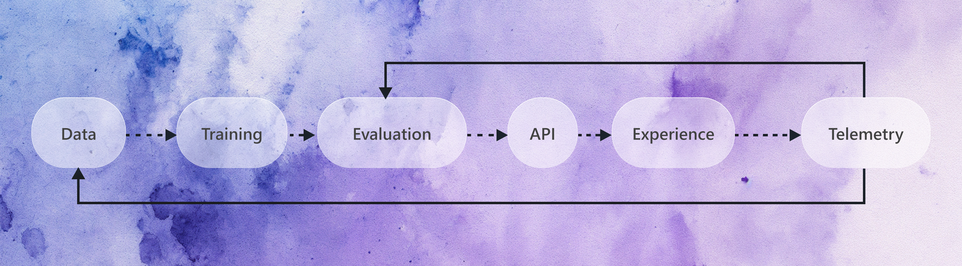
Each step has an owner, an input, and an output. The connections between them are what matters. You can see how a small issue in data quality ripples downstream into model accuracy. You can see how telemetry from real users closes the loop by feeding back into evaluation. It is less a management hierarchy and more a production map. It shows how information moves, not who approves it.
You can already see this in practice. On GitHub, the repository structure tells you more about how things get built than the HR database ever could. A pull request reveals more about collaboration than a meeting calendar. The activity graph is closer to the real heartbeat of a company than any org chart. Every healthy engineering org already has a Work Chart, even if it’s never been drawn.
Across large platforms like Azure AI and GitHub, model launches now happen across shared data, training, and safety loops. What used to require formal approvals now happens through shared dashboards and daily reviews. Everyone sees the same source of truth. As a result, shared visibility made us faster. Hierarchy didn’t do that.
In a traditional hierarchy, information moves upward for decision and downward for execution. Every step adds delay and every retelling distorts the signal. In a Work Chart, information itself becomes the control loop. Once the goal and constraints are visible, decisions can happen locally. The same principle makes distributed computing work. Systems scale when local nodes have access to global context.
In most engineering organizations, time lost to coordination grows roughly with headcount. Speed drops unless context scales faster than people are added. The difference between a 50-person and 500-person org is not talent. It is the bandwidth of shared understanding.
A Work Chart is to an organization what observability is to a system. You don’t manage uptime by asking for status updates, you instrument the code. The same applies to people and products. Fast teams share context. Slow teams share calendars. When everyone can see what’s being built, how it performs, and what good looks like, you don’t need a heavy process. Alignment happens through shared understanding. Dashboards align faster than meetings and metrics travel faster than memos.
Not all loops can be measured in numbers. Some run on stories, prototypes, or conversations. Creative and investigative work leaves qualitative traces, like design decisions, research insights, or shared hypotheses. These belong on the Work Chart too. Observability is shared understanding, whether expressed in metrics or in narrative.
At its best, observability becomes the culture. The biggest drag on speed is re-interpretation, but when teams share what they see they can act with aligned autonomy. Free to decide locally, and therefore faster, grounded in a common intent. In the AI era, clarity replaces command. The Work Chart turns context into a shared artifact.
In a Work Chart, the process of building is codified. A team’s operating loop might live as a README in a repo, a telemetry dashboard, or a product spec. It is versioned, visible, and improved over time. Every change leaves a trace. Every improvement compounds. Just as code evolves through commits, an organization evolves through measurable, visible changes in how work flows. This is what it means to be modern: the work is instrumented, not managed.
You can imagine a Work Chart like this:

A Work Chart is never finished. It is not a static map, but a living reflection of how a system behaves now. The moment it stops evolving, it loses truth. Like observability in code, the power lies in renewal, the ability to see change as it happens and adjust accordingly. The map doesn’t replace the territory but keeps us oriented as the territory shifts.
It’s easier to start this way than to change into it. Newer companies often begin with open loops, where everyone sees the same context. For large organizations, the shift is harder. It means unlearning decades of process designed for predictability, not speed. It means replacing control with clarity, and teaching teams to publish context instead of waiting for direction.
We’re experimenting with this now. We’re learning how to visualize work across hundreds of people and products, to make loops visible without adding bureaucracy, and to build observability into how we operate, not only what we ship. It is not easy, and takes both design and discipline. But it’s necessary.
I think in the future, winning organizations will look less like pyramids and more like living systems. They will be clear, responsive, and self-correcting. They will scale through clarity rather than control, and through reflection rather than review. Org charts will still exist, but they’ll tell only a small part of the story. The truth will live in the Work Chart, as the living map of how things get done.